Brands, researched. Not guessed.
Every identity we craft begins with a question, not a sketch. We study your market, audience and competitors first, then design a minimal, memorable brand built to last.
New brands, built from scratch
Companies that began their journey with us — a complete identity created from a blank page, the first logo they ever had. Click any piece to view it full size.
Stirr · Craft Coffee
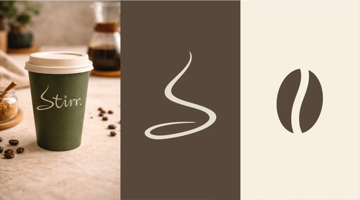
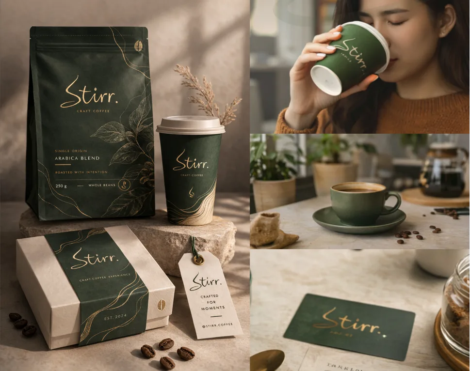
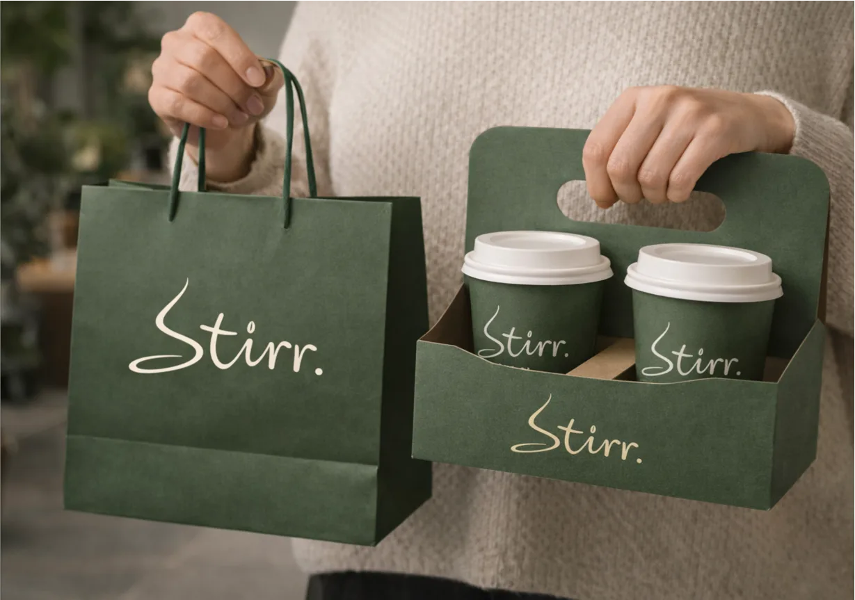
Stirr came to us as a name and an ambition — no logo, no identity, nothing. We built the whole brand from a blank page. The wordmark is a custom flowing script, the ‘S’ rises like a ribbon of steam, and a matching coffee-bean icon anchors the system. Wrapped in earthy forest-green and warm gold, it feels premium and craft-led everywhere it lands — from a takeaway cup to the shopfront.
- Custom hand-drawn script wordmark
- ‘S’ monogram doubles as a steam swirl
- Coffee-bean icon for stamps & favicons
- Full packaging & collateral system
 ⚲ Click to zoom
 Case study · Built from scratch
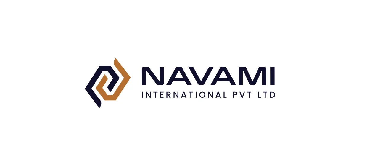
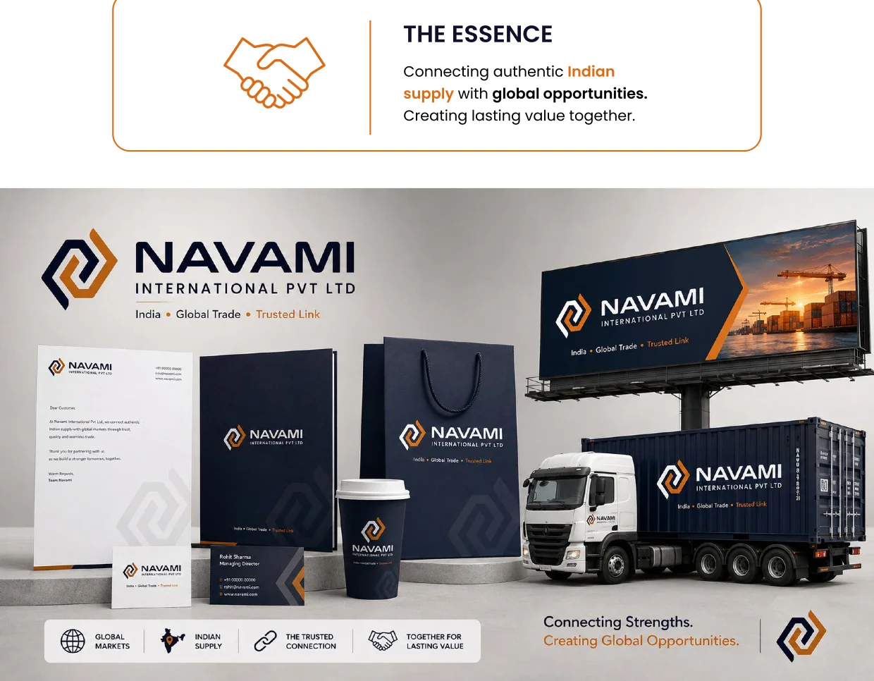
Navami International Pvt Ltd
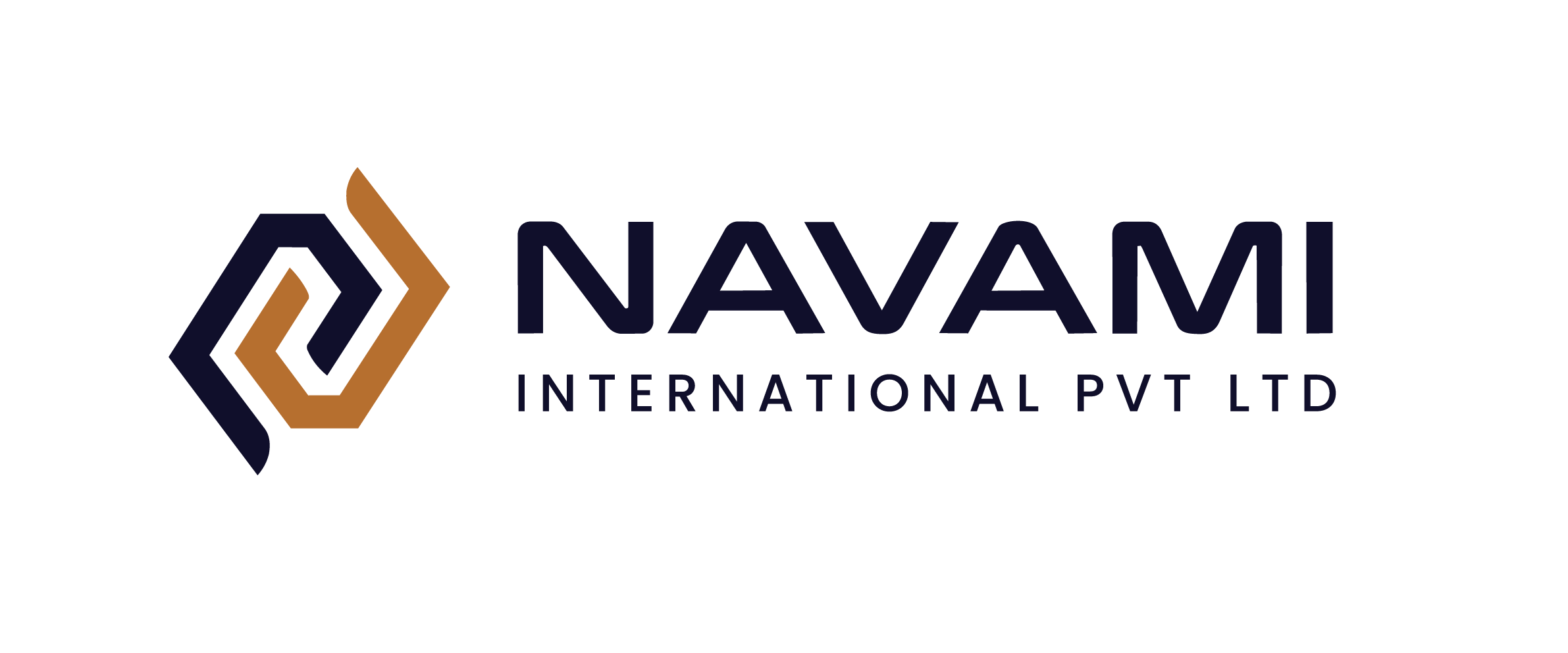
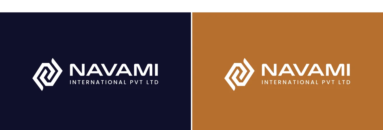
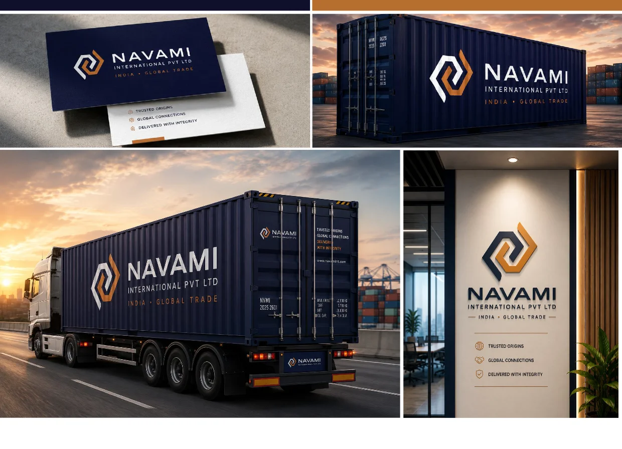
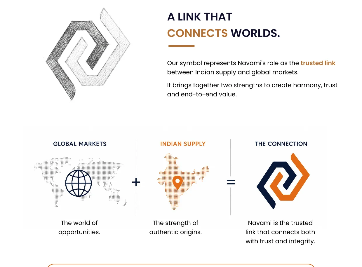
Navami connects authentic Indian supply with global markets. We built its identity from a blank page around a single idea — a link. The interlocking mark fuses two shapes into one continuous, unbroken chain: the strength of authentic origins meeting a world of opportunity. A deep-navy and warm-copper palette gives it trust, permanence and premium global appeal — carried across cards, containers, fleet and signage.
- Interlocking ‘link’ monogram — two strengths, one chain
- Symbolises trusted India-to-global trade
- Deep-navy & copper palette for trust & premium feel
- Full system: stationery, containers, fleet & signage
Varnam Natyashala
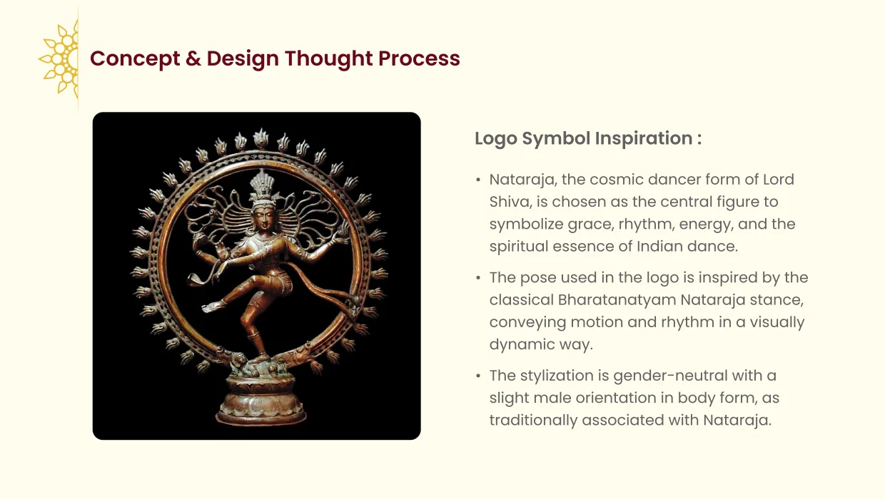
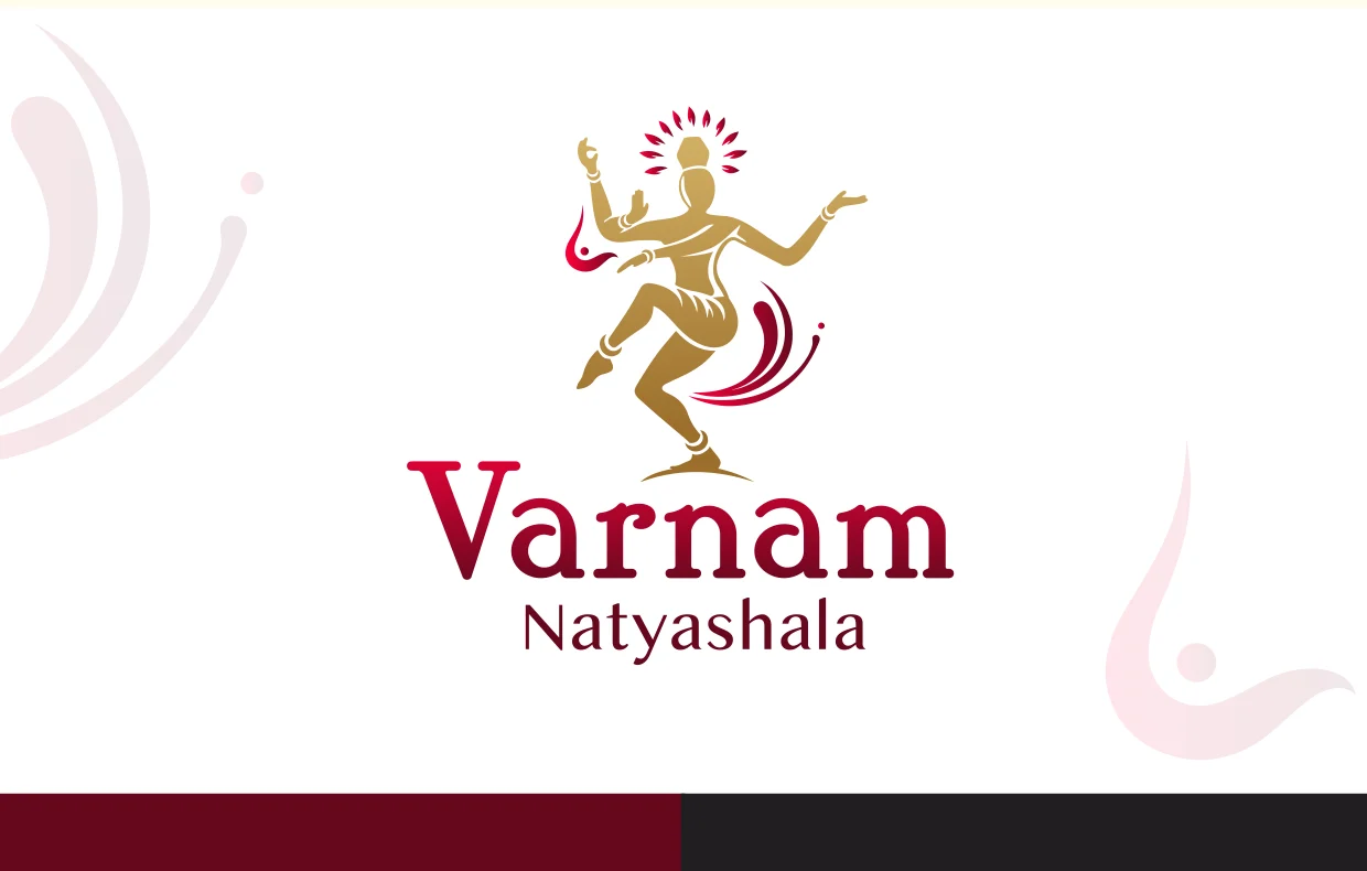
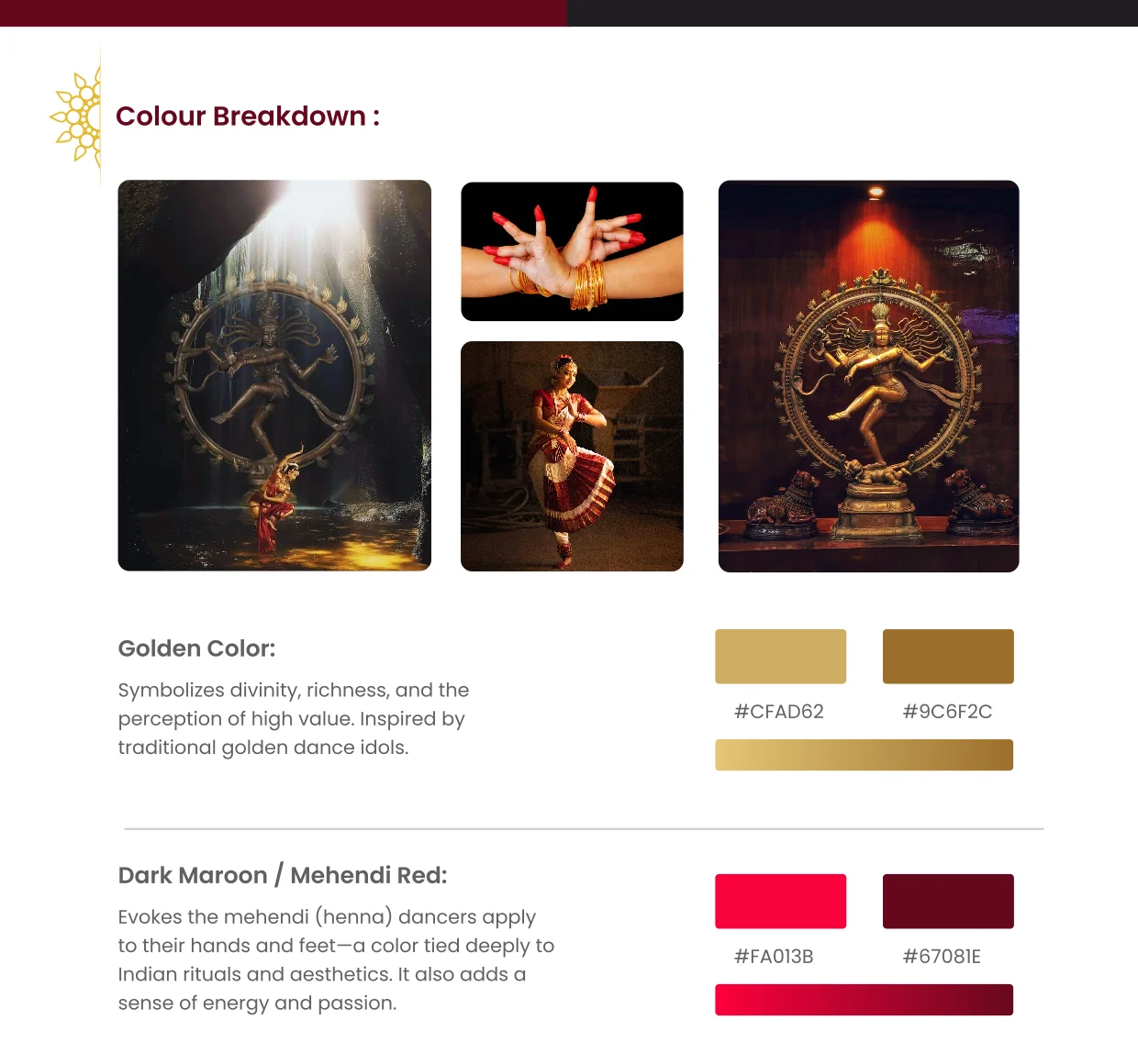
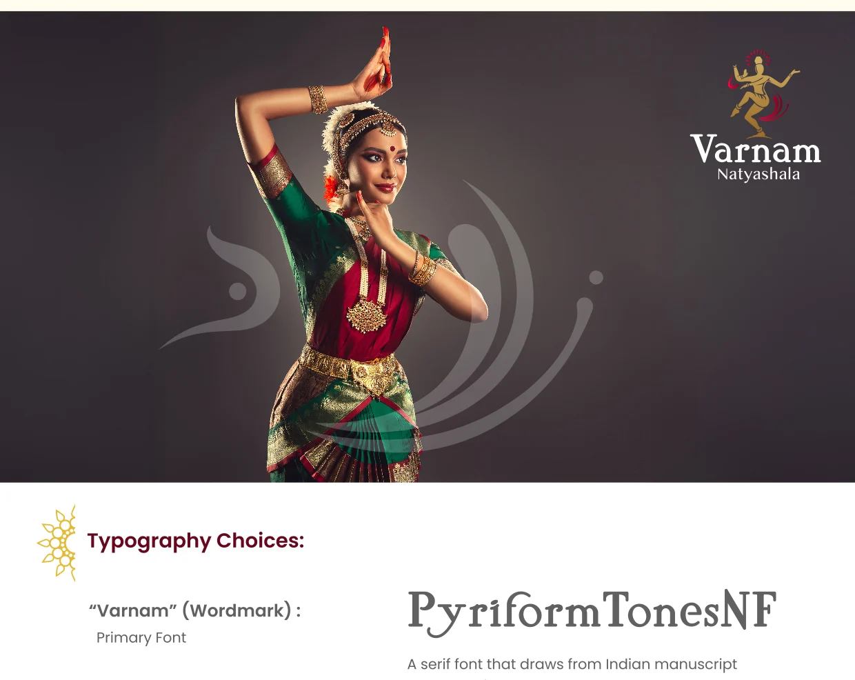
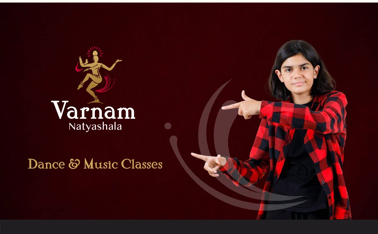
Varnam is a classical & contemporary dance academy rooted in Bharatanatyam. We built its identity from scratch around Nataraja — the cosmic dancer — stylised in a modern, gender-neutral Bharatanatyam stance that conveys grace, rhythm and energy. A regal gold and mehendi-red palette ties it to Indian ritual and craft, while a manuscript-inspired serif wordmark balances heritage with a modern edge.
- Nataraja mark — grace, rhythm & spiritual energy
- Gold + mehendi-red; ritual, richness & passion
- Manuscript-style serif wordmark, modern edge
- Works on light & dark, badge to banner
Sync Health
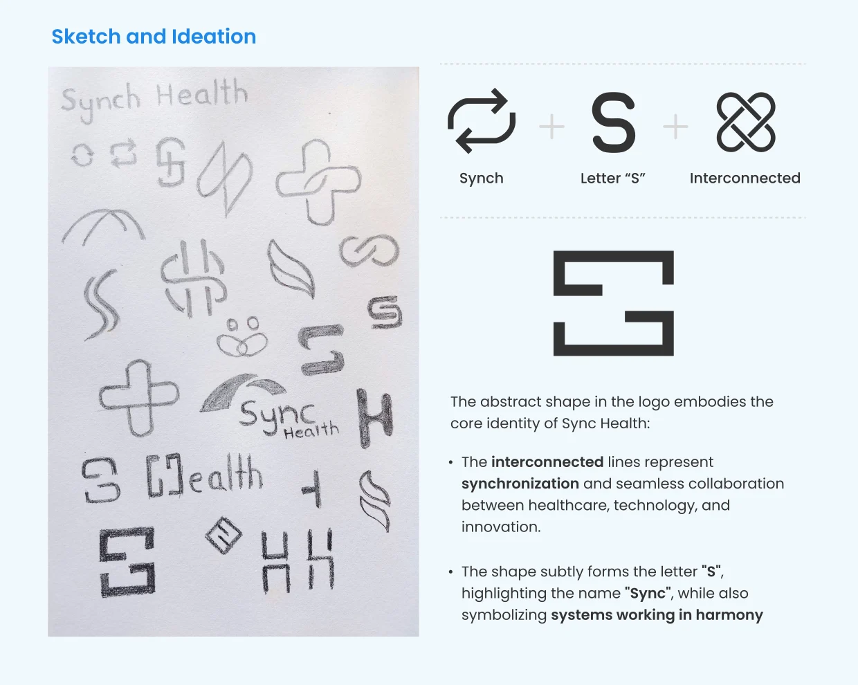
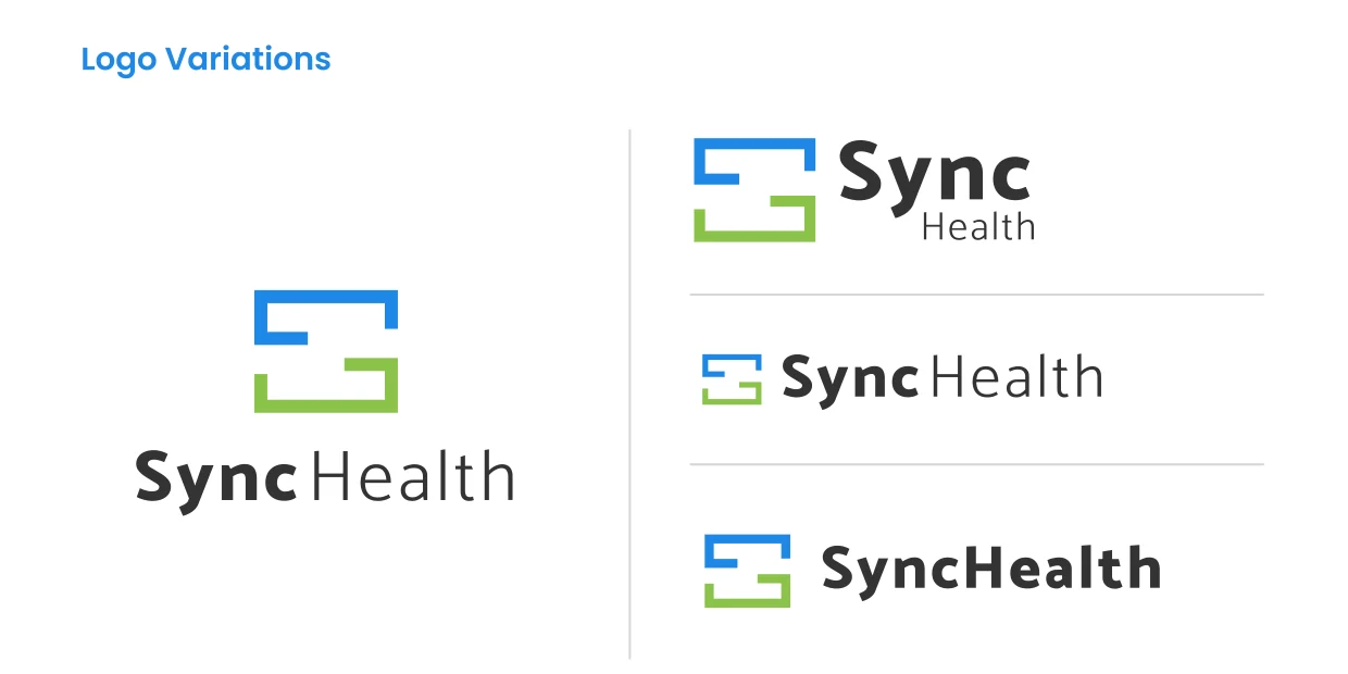
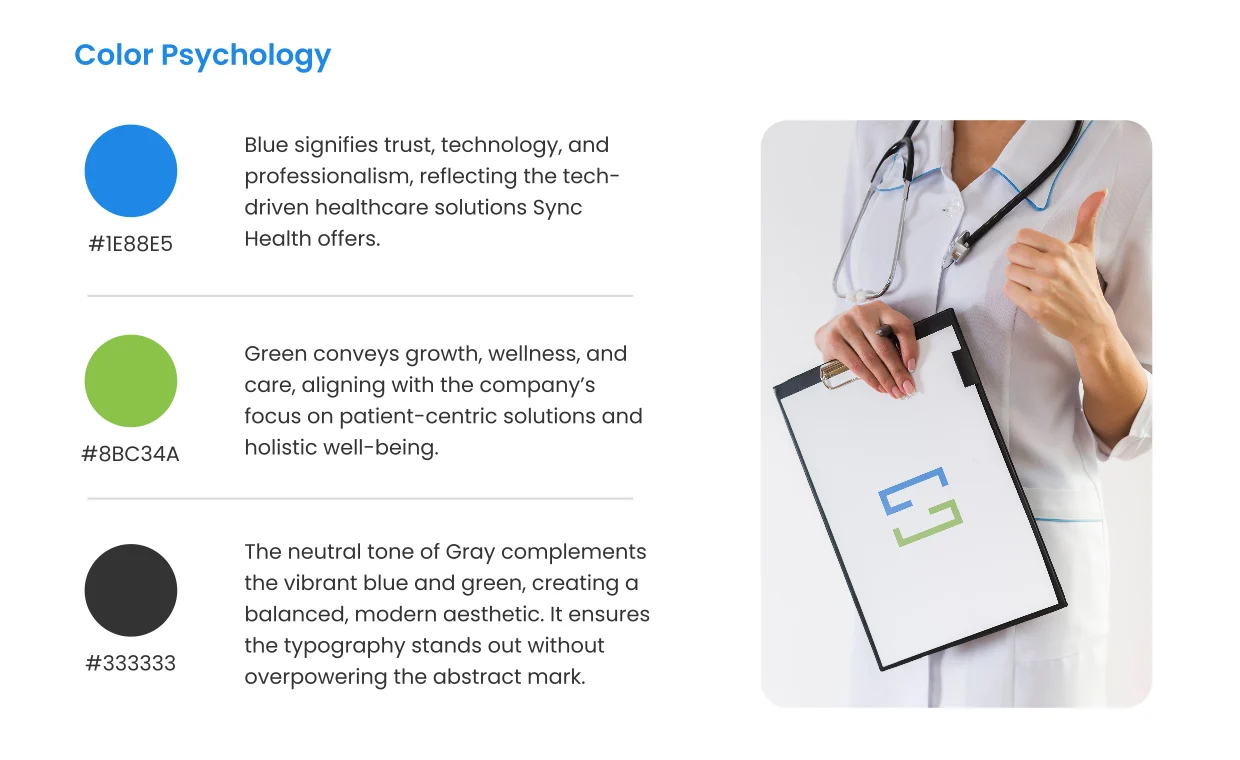
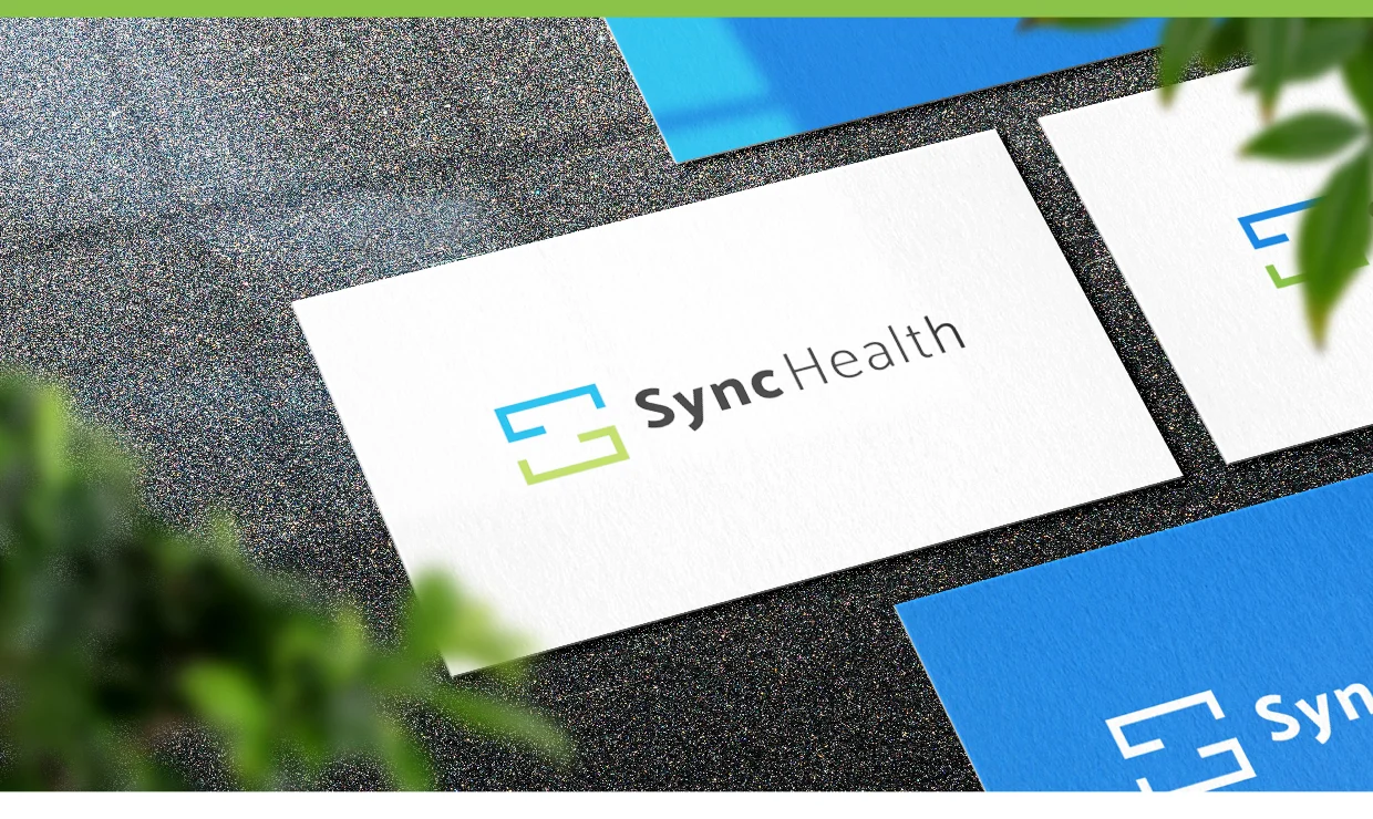
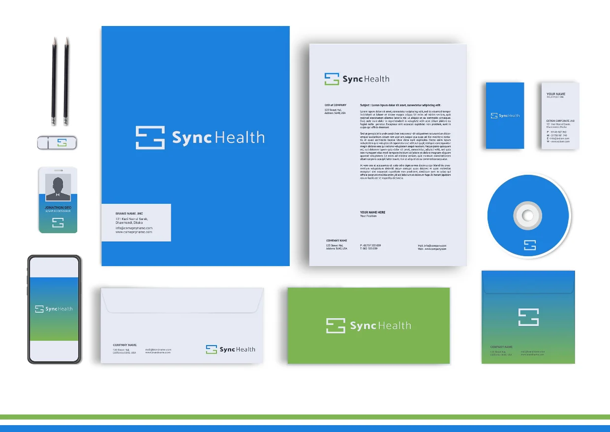
Sync Health brings together healthcare, technology and investment expertise to build platforms for healthcare organisations. We designed the identity from scratch around a single abstract mark — interconnected lines that subtly form the letter ‘S’, symbolising synchronisation between clinicians, patients and systems. A trustworthy blue and a caring green, balanced by neutral grey, give it a modern, credible, tech-driven feel.
- Interconnected mark that reads as an ‘S’
- Symbolises synchronisation & seamless care
- Blue = trust & tech; green = wellness & care
- Clean geometric type; digital & print ready
Shuka.ai
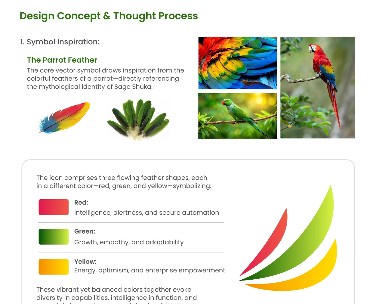
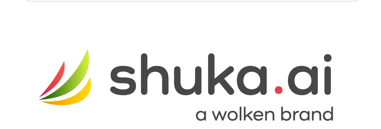
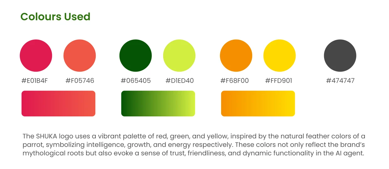
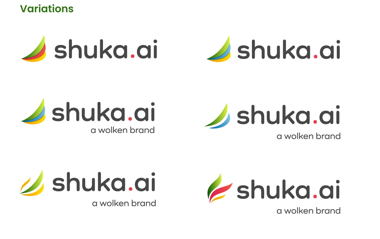
Shuka.ai is Wolken Software’s next-generation enterprise AI-agent platform. We created the identity from scratch around the parrot feather — a nod to the mythological sage Shuka and to wisdom. Three flowing feathers in red, green and yellow signal intelligence, growth and energy. A friendly rounded wordmark keeps the AI human and approachable, with a single red dot on “.ai” marking its intelligent core.
- Parrot-feather mark — wisdom & Indian heritage
- Red, green & yellow: intelligence, growth, energy
- Rounded, friendly, human wordmark
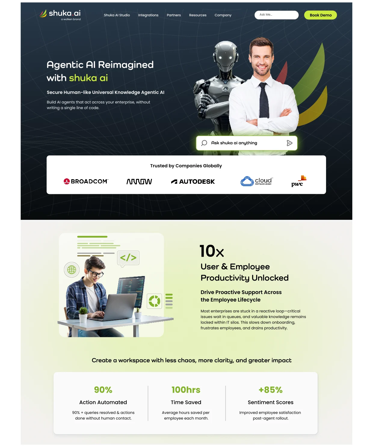
- Scales from favicon to full website UI
Rebrands & logo refinements
Established businesses that came to us to fix, modernise or elevate an existing logo. See the difference — before, and after.
Nesara Ayurveda Center
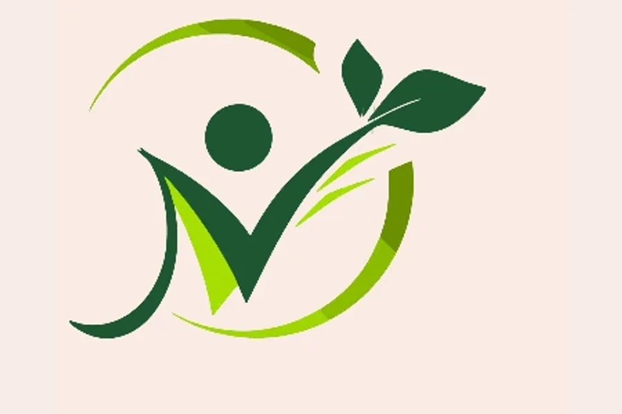
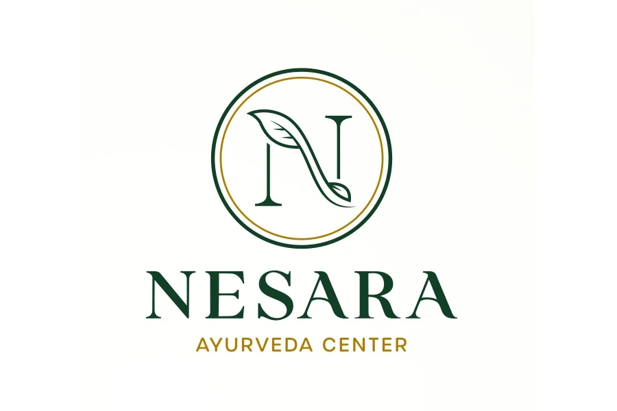
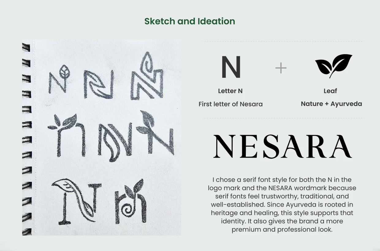
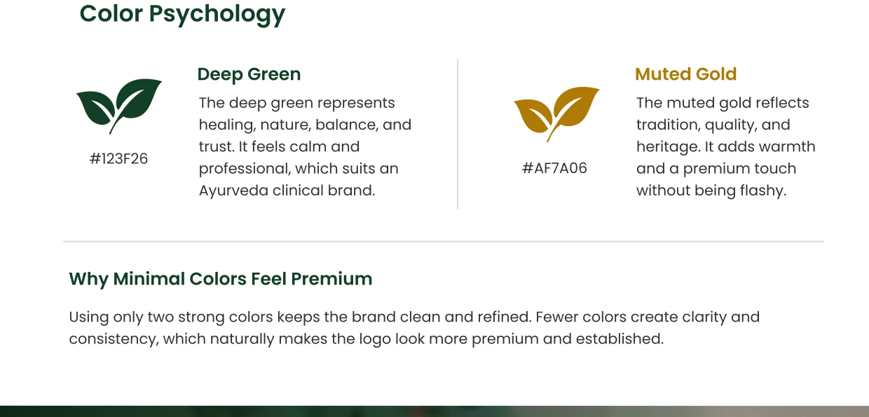
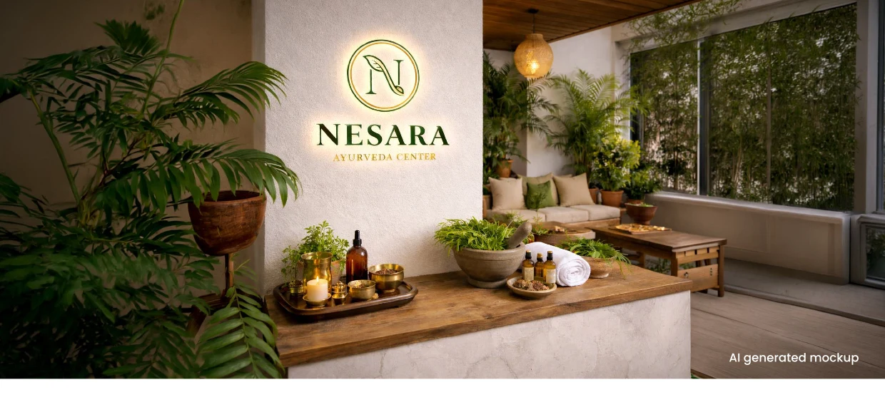
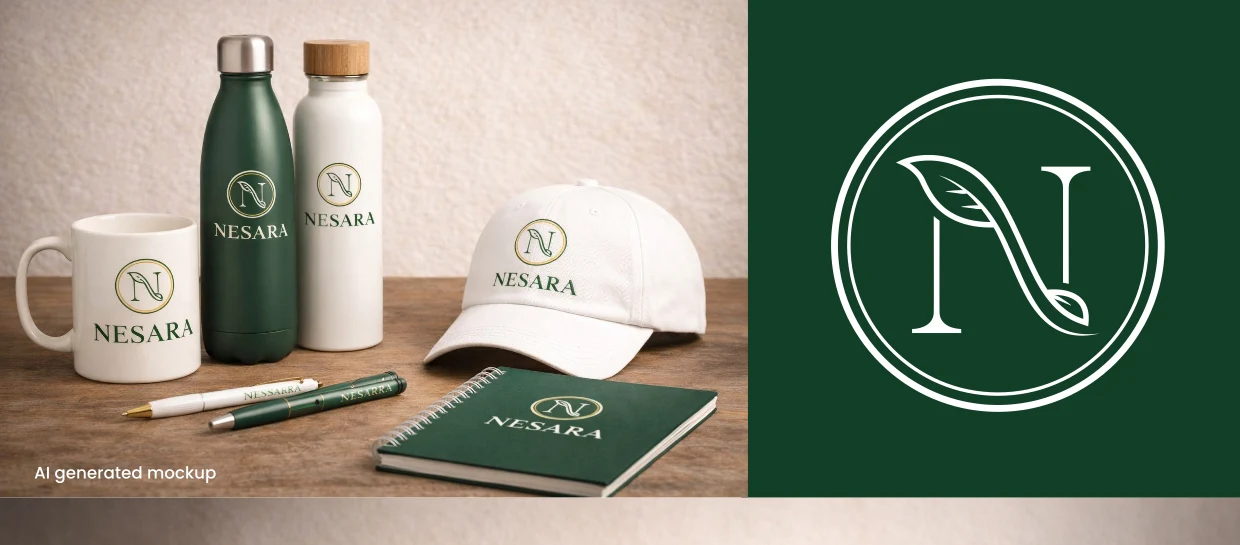
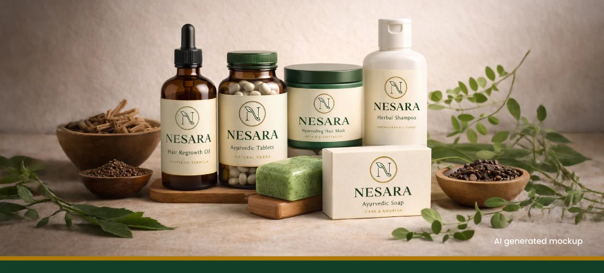
Nesara came to us with an off-the-shelf, clip-art style logo — a generic human-leaf-circle mark that could belong to any wellness brand and didn’t feel premium. We rebuilt it around one idea: the letter N woven with a leaf. Serif letterforms bring heritage and trust, while a deep-green and muted-gold palette signals healing and quality. The result is an ownable monogram that scales from a signboard to a soap wrapper.
- From a generic stock symbol to an ownable ‘N + leaf’ mark
- Serif letterforms for heritage & trust
- Deep-green & muted-gold; calm and premium
- Scales cleanly from signage to product labels
Vishaal · Agriculture & Global Trade
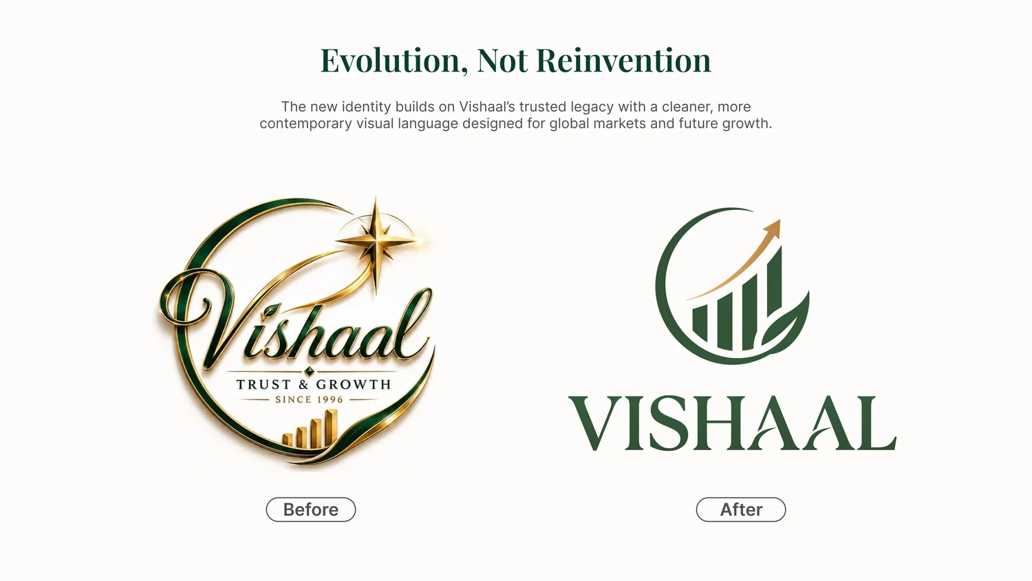
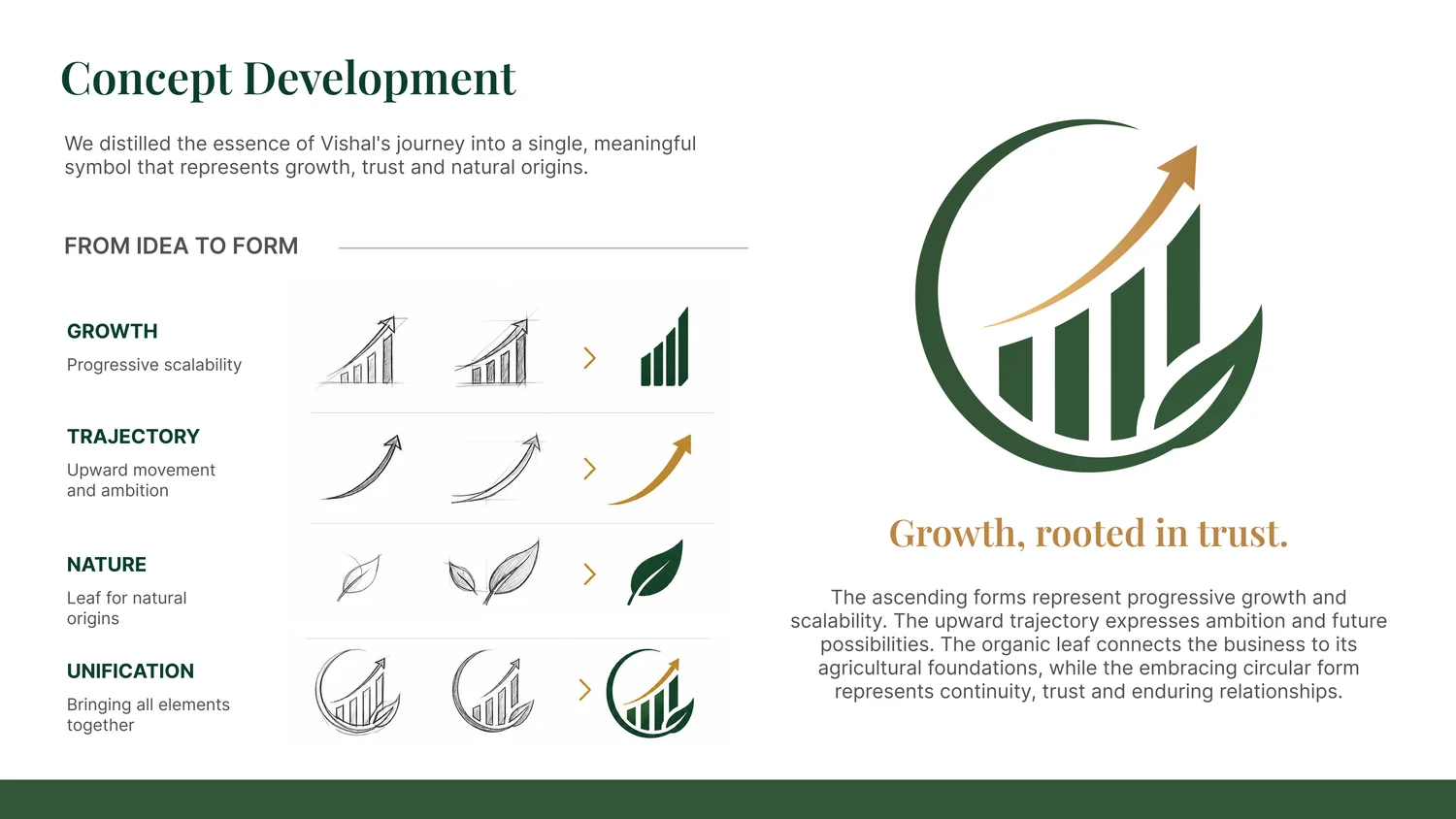
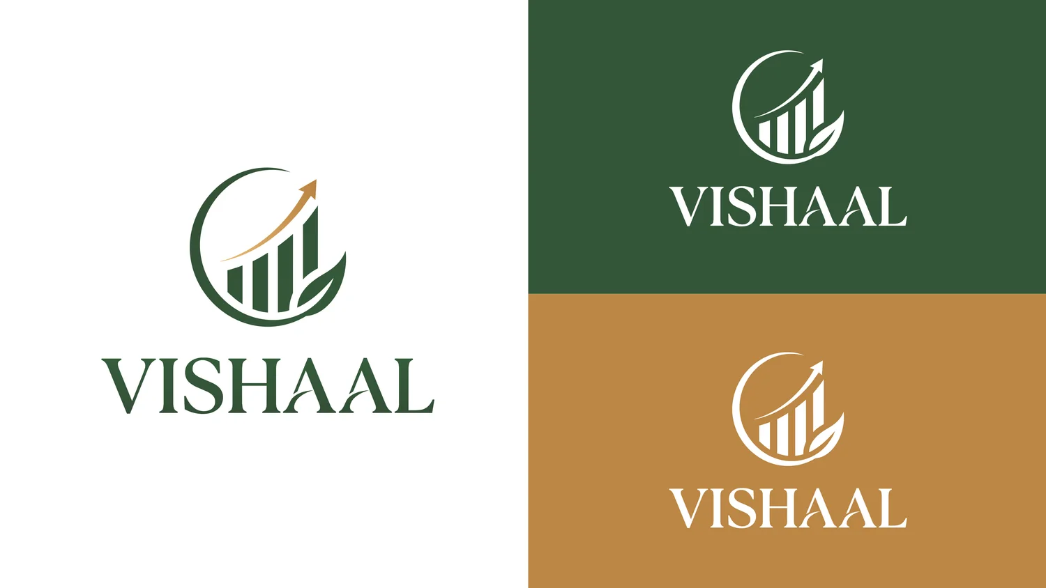
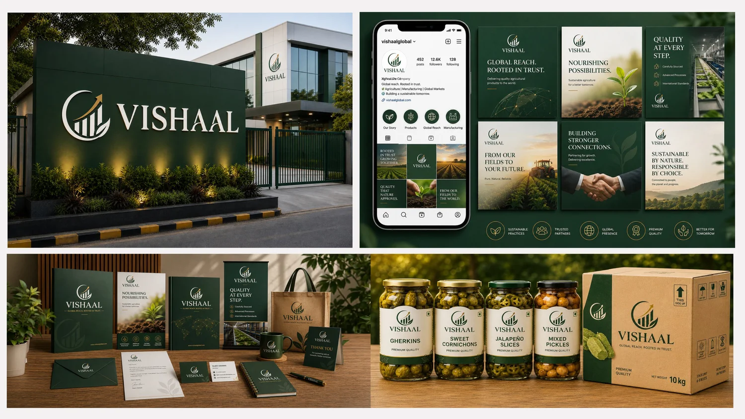
Vishaal has spent nearly three decades at the intersection of agriculture, food manufacturing and global markets. Its old identity — an ornate gold script wrapped in stars, circles and fields — told too many stories at once and no longer reflected a modern global business. We refined it into a single idea: growth, rooted in trust. Ascending bars and an upward arrow express ambition and scale; an embracing circle and leaf tie it back to agricultural roots. Clean, scalable, and built for the next thirty years.
- One clear idea — growth, rooted in trust
- Ascending bars + arrow = ambition & scale
- Circle + leaf = trust & agricultural roots
- Deep-green & gold; works from favicon to signage
Vibha · Filter Coffee
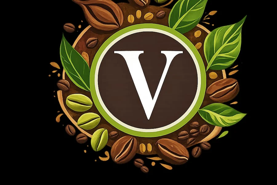
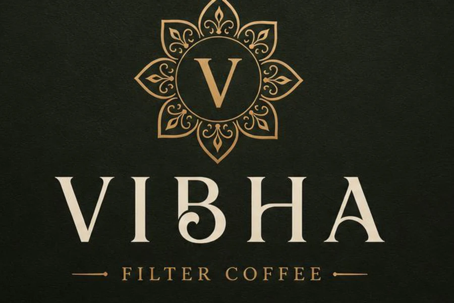
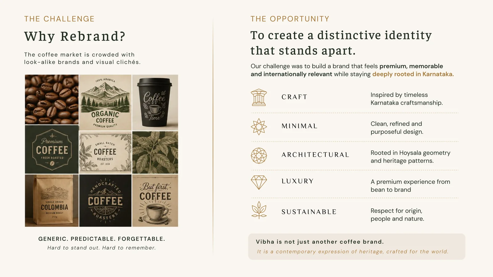
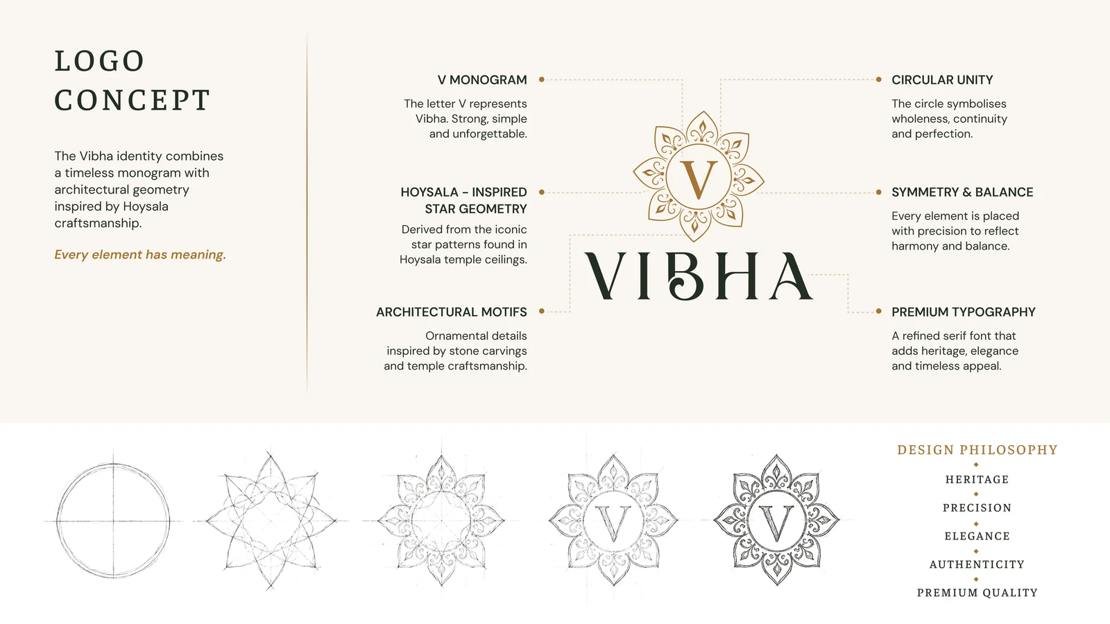
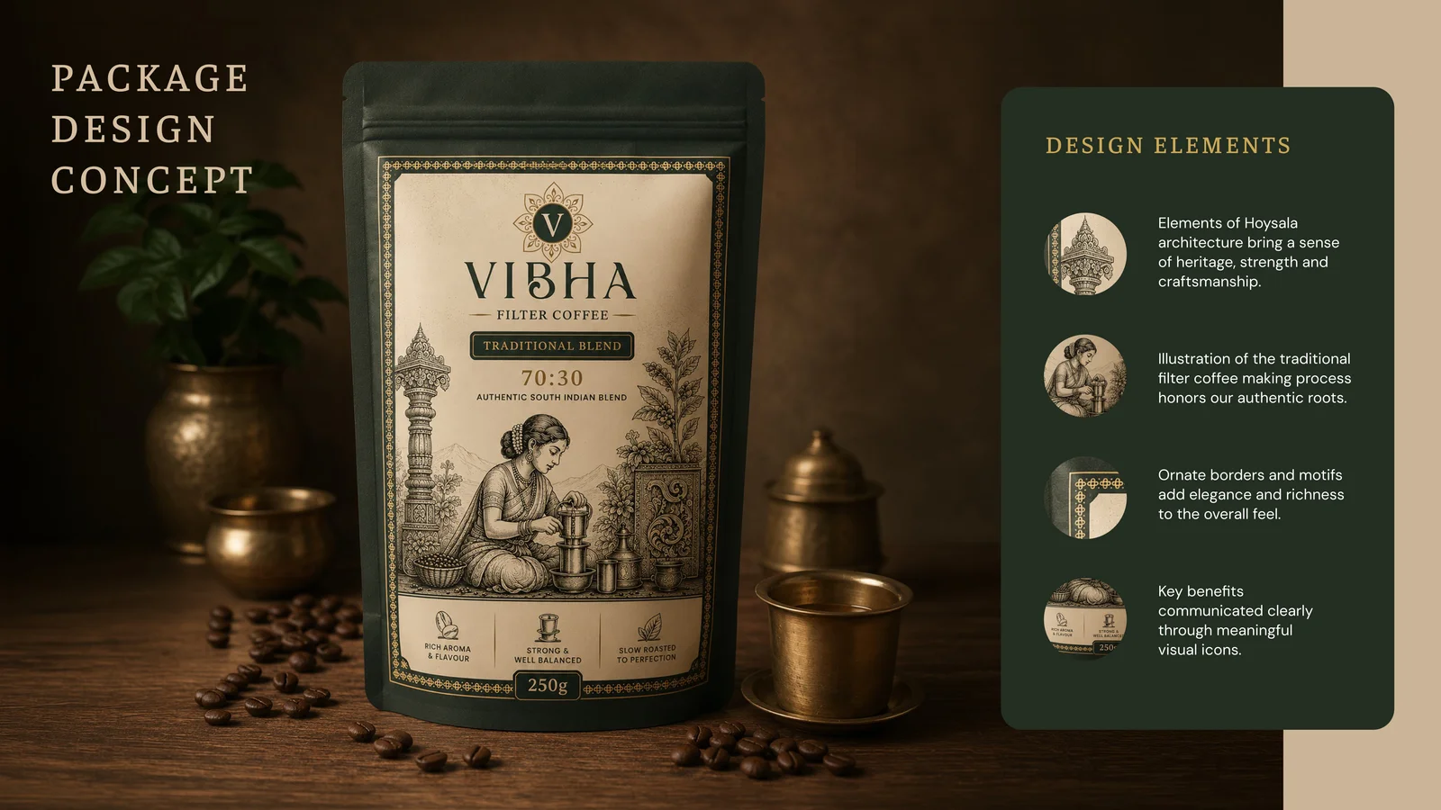
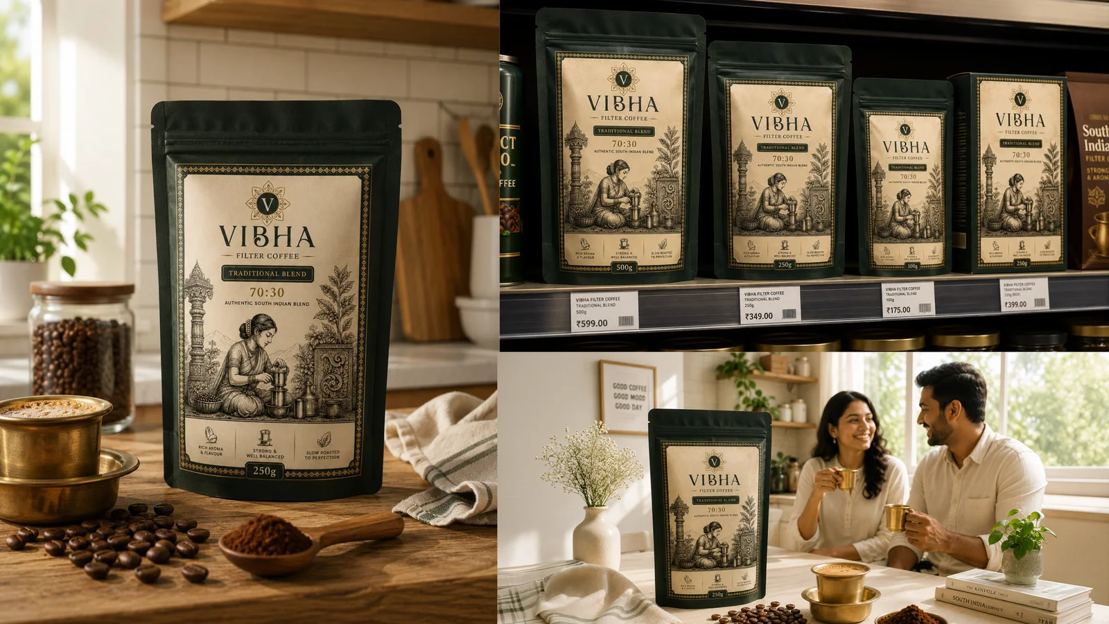
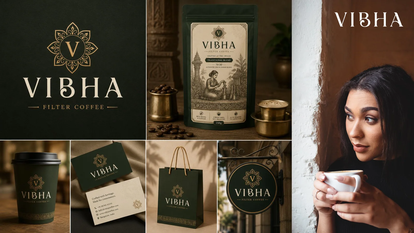
Vibha’s original logo — a literal ‘V’ crowded with coffee beans and leaves — looked like every other coffee brand and didn’t feel premium. We rebranded it around one distinctive idea: heritage, refined. A clean ‘V’ monogram sits inside a mandala drawn from the star geometry of Hoysala temple architecture, paired with an elegant serif wordmark in deep forest-green and antique gold. The result is memorable, premium and unmistakably South-Indian — carried across pack design, retail and collateral.
- From a literal beans-and-leaves logo to one clean idea
- ‘V’ monogram inside a Hoysala-inspired mandala
- Refined serif wordmark; forest-green & antique gold
- Full pack, retail & collateral system
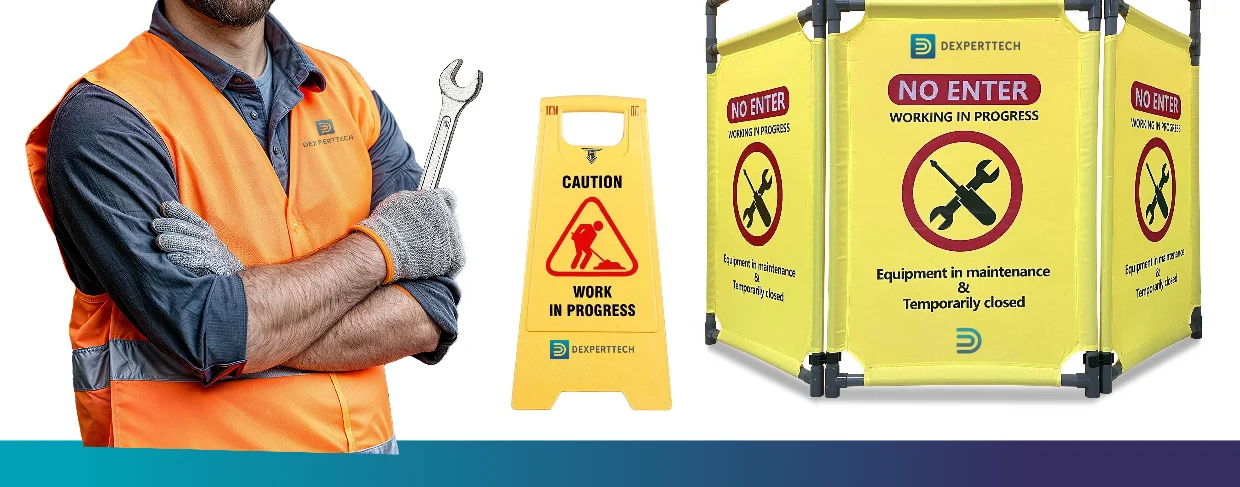
Dexperttech · Engineering Consultancy
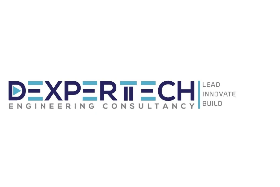
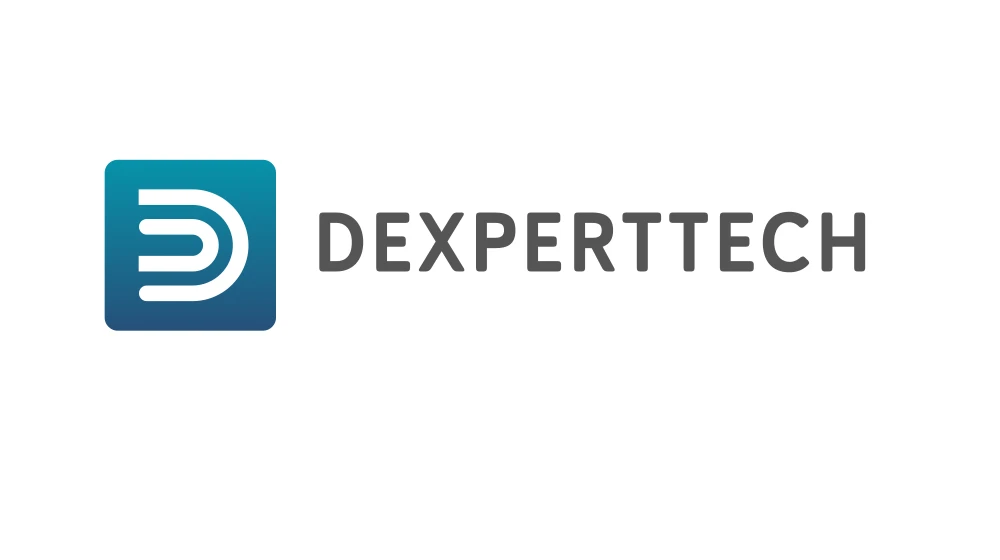
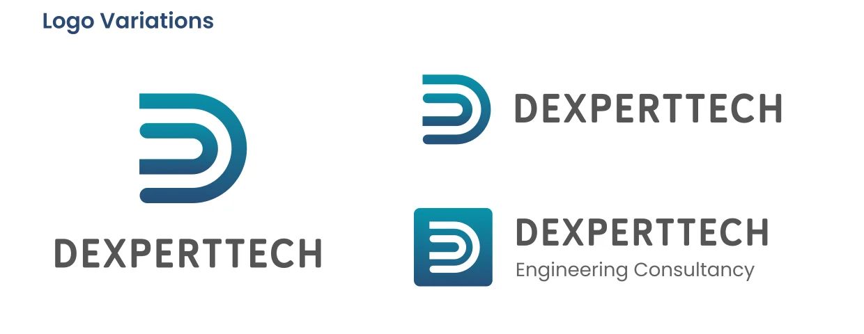
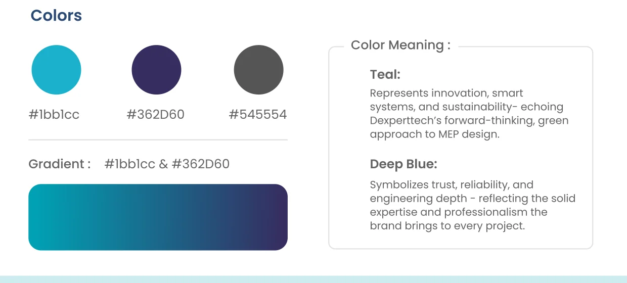
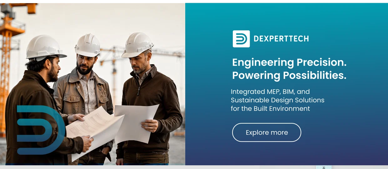
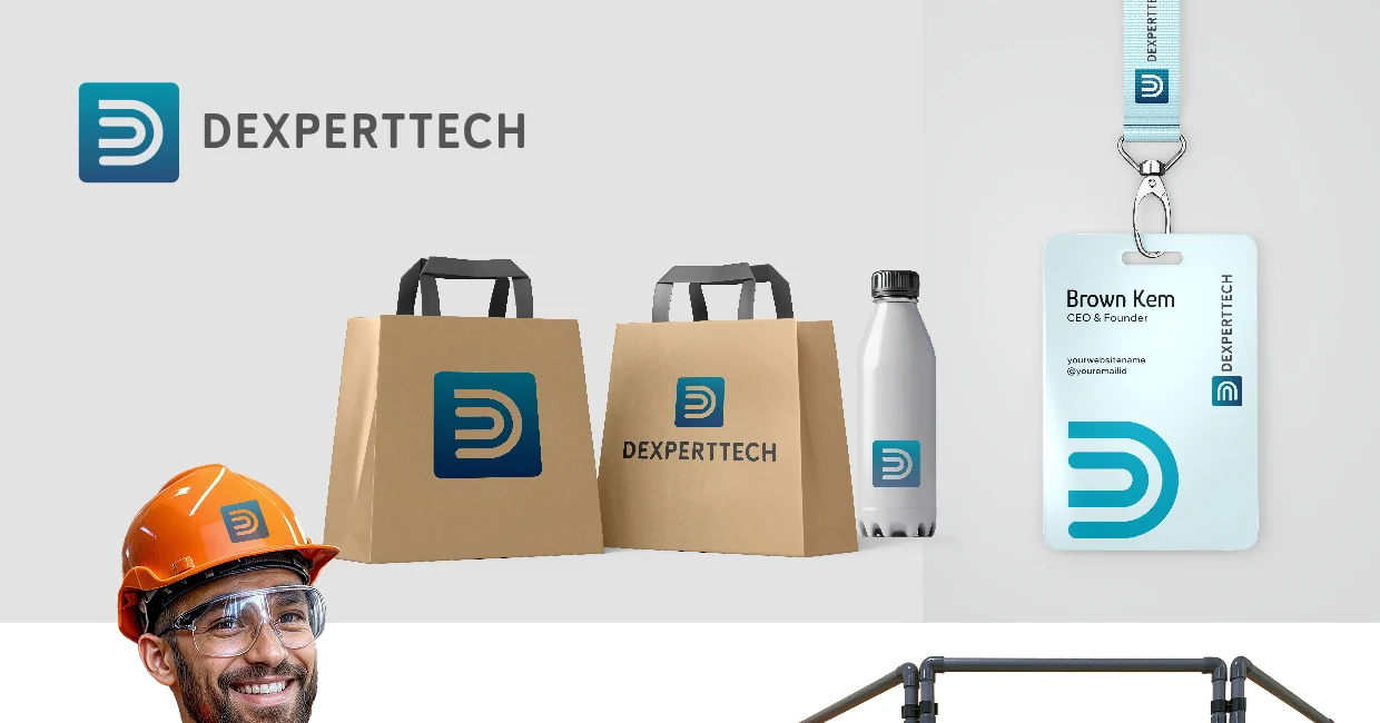
Dexperttech’s old logo tried to say everything at once — fragmented lettering, cyan bars, a generic triangle and two taglines — making it cluttered and hard to recall. We refined it into one powerful idea: a clean ‘D’ mark built from two curved lines that echo the flow of HVAC ducts, conduits and pipes — the mechanical veins of MEP engineering. A teal-and-deep-blue palette signals innovation, trust and engineering depth.
- From cluttered lettering to one clean ‘D’ mark
- Curves echo MEP systems — ducts, conduits, pipes
- Teal + deep blue: innovation, trust & depth
- Legible on drawings, helmets, signage & screens
Brand guidelines & company profiles
The documents that carry your brand into the world — editorial company profiles, pitch decks and full brand-guideline books that keep everything consistent.
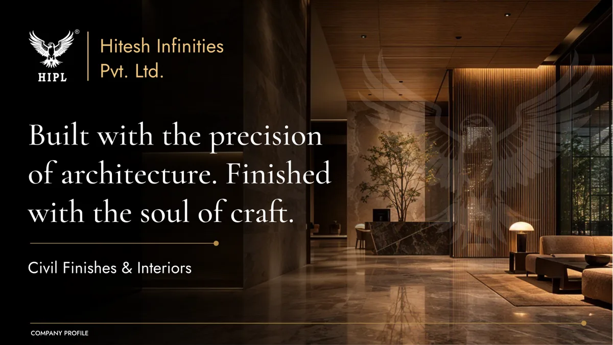
Hitesh Infinities (HIPL)
A magazine-grade profile for a luxury interiors firm, carrying the line “the precision of architecture, the soul of craft.”
- Editorial layout & art direction
- Story, services & portfolio spreads
- Print-ready and digital versions
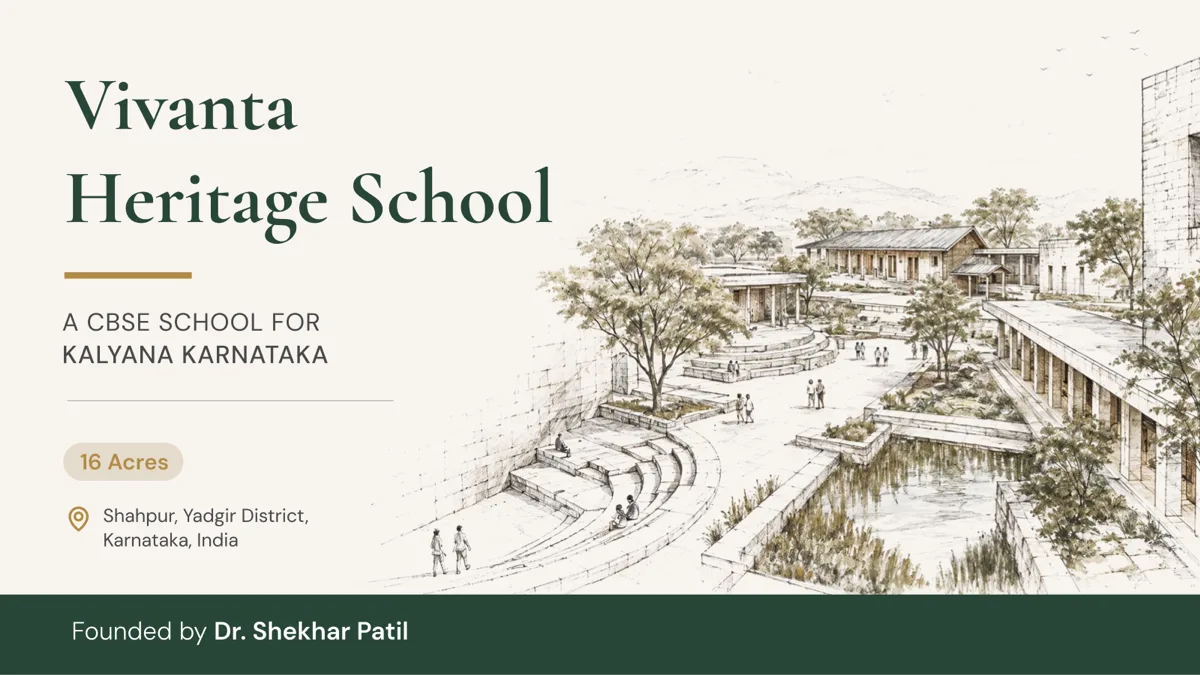
Vivanta Heritage School
An editorial profile pairing hand-drawn heritage architecture with a calm, scholarly identity that reflects the school’s values.
- Custom heritage illustrations
- Prospectus & admissions spreads
- Consistent type & colour system
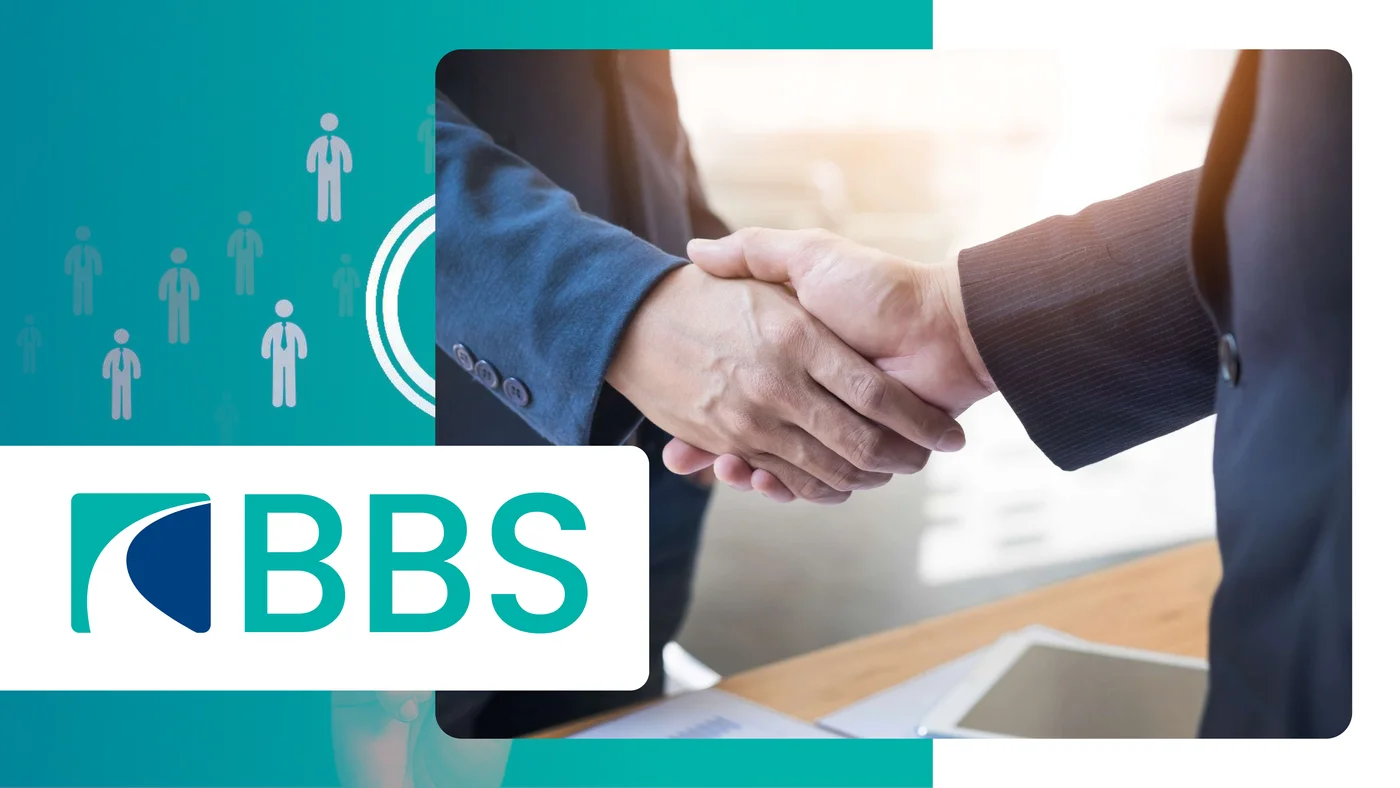
BBS
A clean, corporate profile for a business-services firm — a confident teal-and-navy identity with a people-first, partnership-led feel.
- Corporate editorial layout
- Services & capability spreads
- Print-ready and digital versions

Career Path Private Limited
An aspirational profile for a careers and skilling company, themed around growth and progression in a warm teal-and-gold palette under the line “Empowering Minds.”
- Brand-aligned editorial design
- Programmes & services spreads
- Print-ready and digital versions
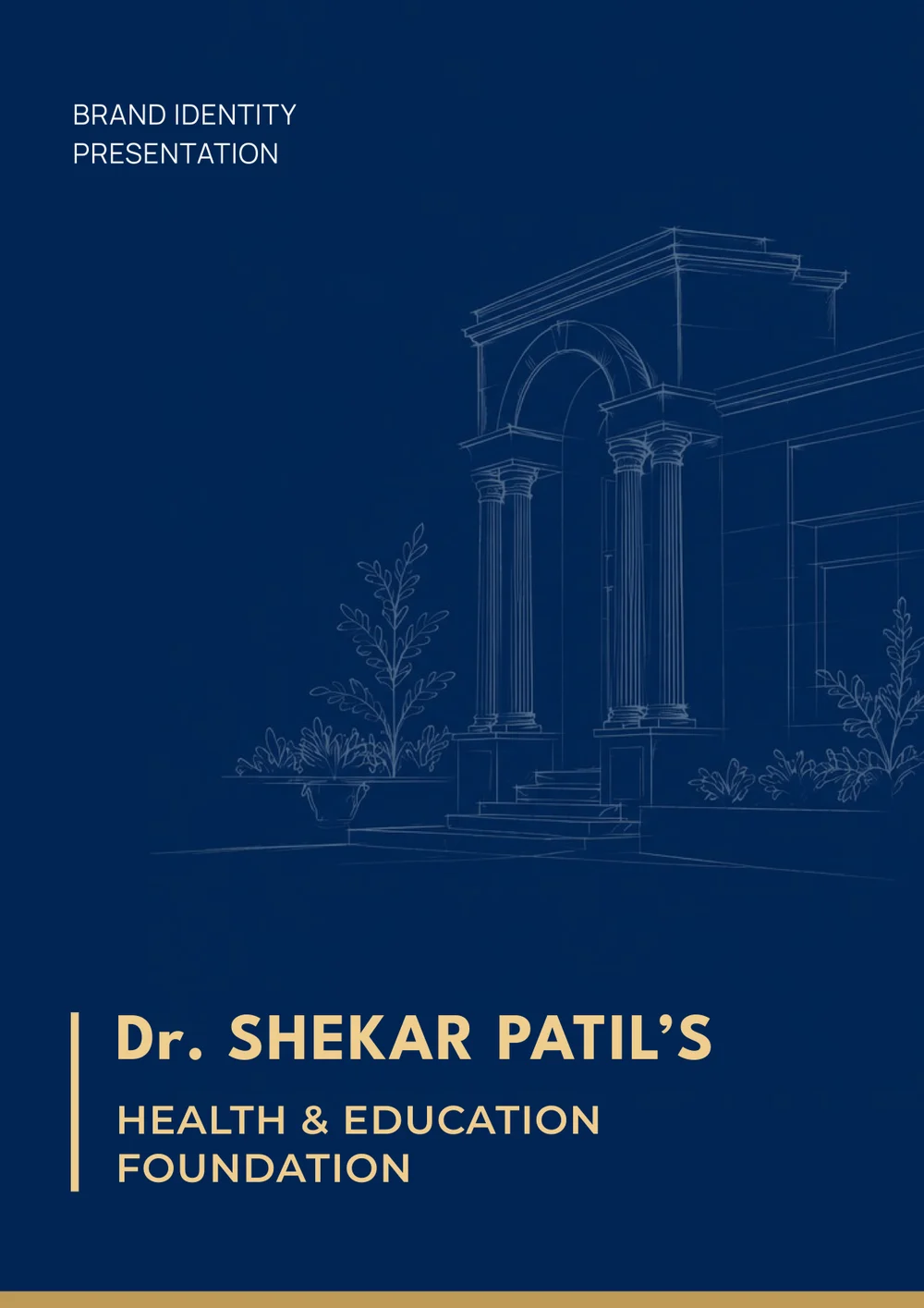
Dr. Shekar Patil’s Health & Education Foundation
A brand identity presentation for a health & education foundation, built around a heritage-inspired architectural motif in a dignified navy-and-gold palette.
- Identity concept & rationale
- Colour, type & usage system
- Print-ready presentation deck
A complete system, not a single file
Logo Suite
Primary, secondary & monogram, favicon, clear-space rules.
Colour System
Primary & secondary palette, tints, usage ratios, contrast.
Typography
Brand typefaces, hierarchy, print & web pairings.
Brand Guidelines
A governance brand book that keeps everything consistent.
Company Profile
Editorial profile & pitch deck that sells your story.
Stationery and Print
Visiting cards, letterhead, envelopes and signage.
Social Kit
Profile assets, templates and banners, ready to post.
Website Design (Figma)
High-fidelity UI, a design system and dev-ready handoff.
Digital experiences, engineered to convert
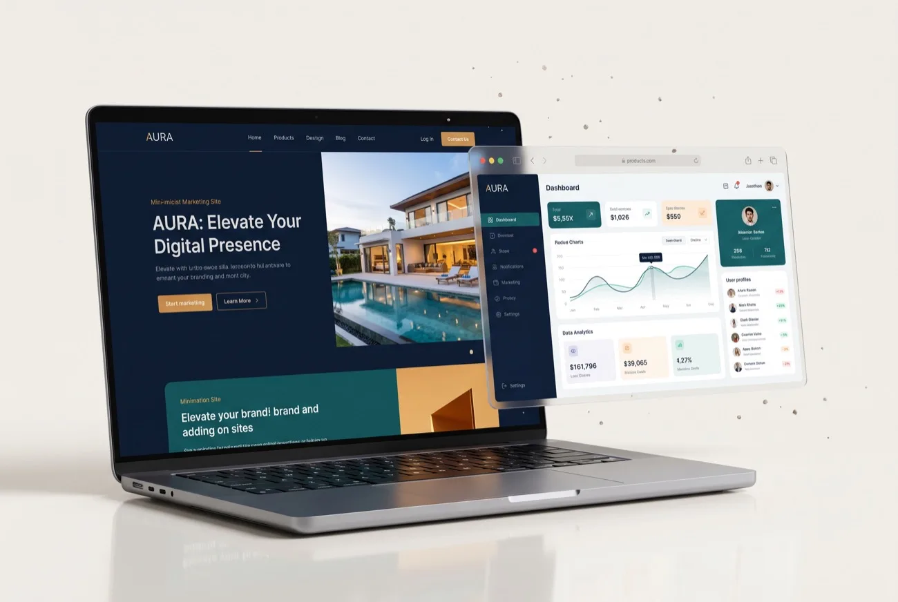
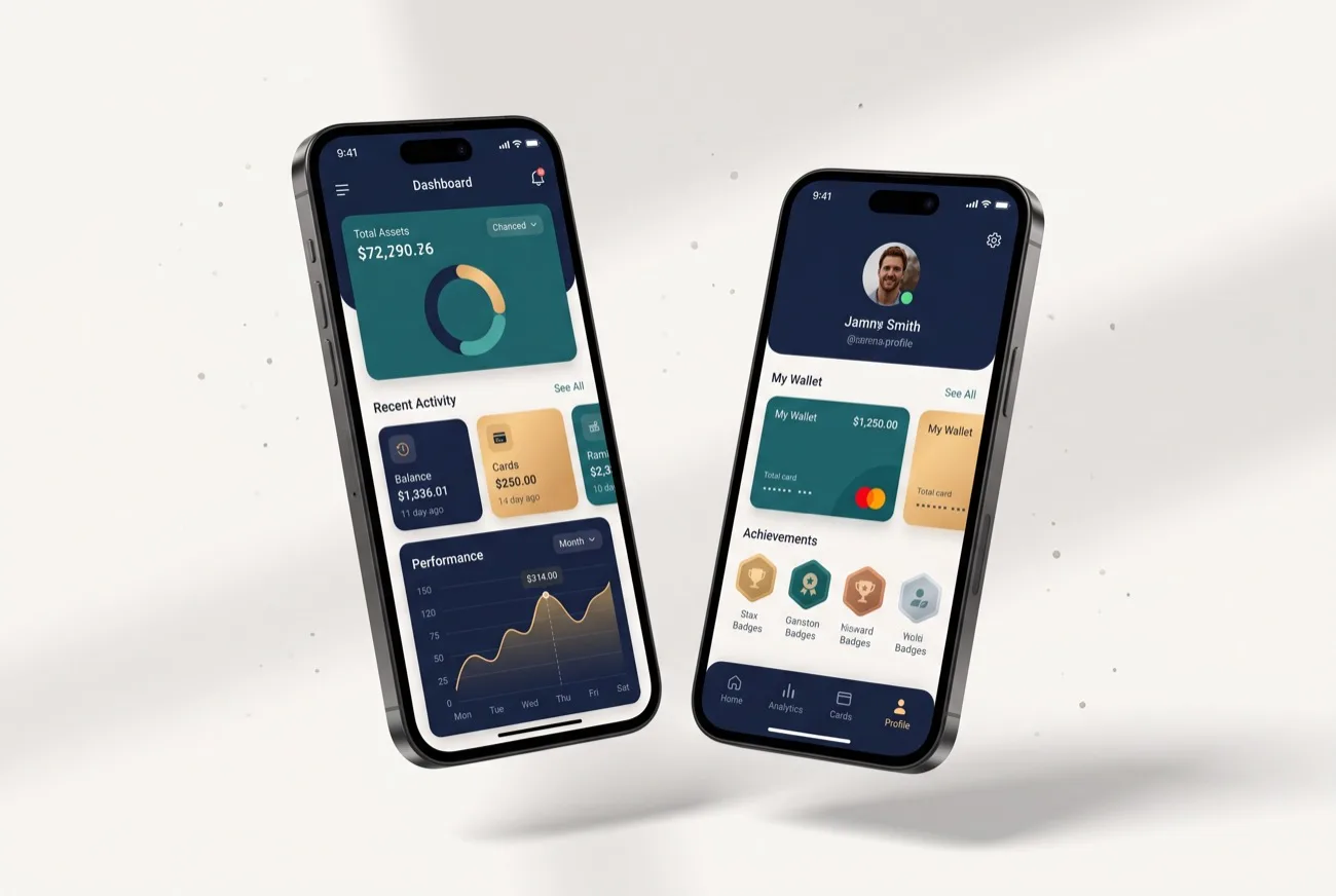
Beyond identity, we design and build high-fidelity websites and mobile apps in Figma. From simple marketing sites to full products, everything is crafted to look sharp and perform.
Explore our packages
Clear, upfront pricing for everything we do — pick the area you need.
Have a brand worth building?
Let’s turn what your business means into what it looks like.
Start a Brand Project →